| . |

| Never say... It will never happen again. |
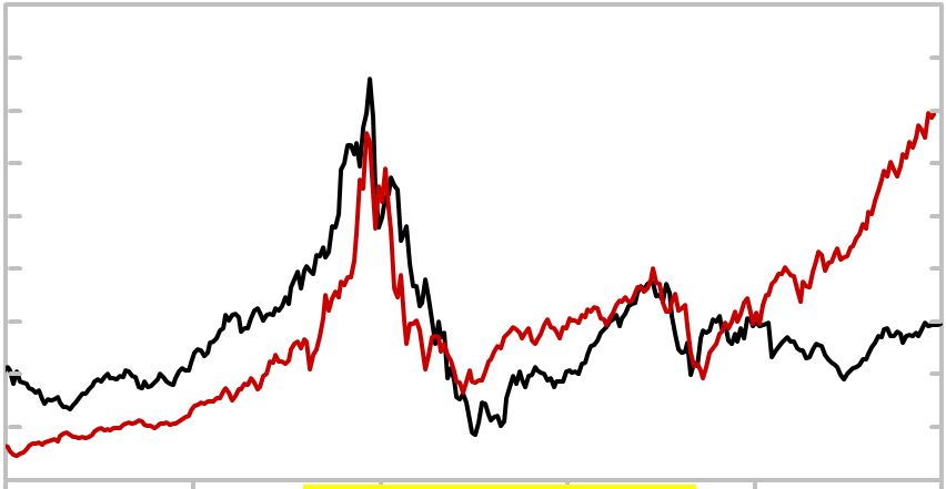
| DJIA vs. NASDAQ: Updated Monthly |
The monthly close for the Dow Jones Industrial Average (DJIA) is shown in black and
the NASDAQ in red. The NASDAQ (7/1990 - Present) is superimposed over the Dow
(1920-1954) to show the correlation between the indexes during those periods. The
dates, returns and scales pertain to the DJIA if in black, the NASDAQ if in red.
Updated 1/17/2018
the NASDAQ in red. The NASDAQ (7/1990 - Present) is superimposed over the Dow
(1920-1954) to show the correlation between the indexes during those periods. The
dates, returns and scales pertain to the DJIA if in black, the NASDAQ if in red.
Updated 1/17/2018
|
|
7/1990 7/1995 7/2000 7/2005 7/2010 7/2015 7/2020
1/1920 1/1925 1/1930 1/1935 1/1940 1/1945 1/1950
A
C
D
B
E
F
G
| 400% (A-B) |
| DJIA (1920 - 1943) |
| NASDAQ (1990 - Present) |
| 372% (E-F) |
| -89% (B-E) |
| 697% (A-B) |
| 135% (E-F) |
| -78% (B-E) |
| -52% (F-G) |
H
| 50 |
| 100 |
| 150 |
| 200 |
| 250 |
| 300 |
| 350 |
710
1430
2140
2860
3570
4290
5000
| 400 |
5710
| Great Depression Stock Chart |
There is a disturbing correlation between the NASDAQ Composite
index since 1989 and the DJIA during 1920-1943. Each period
experiences a boom, bust and a partial recovery followed by another
bust of surprisingly similar magnitude, slope and duration.
index since 1989 and the DJIA during 1920-1943. Each period
experiences a boom, bust and a partial recovery followed by another
bust of surprisingly similar magnitude, slope and duration.
The graph below superimposes 27 years of the NASDAQ (1989-2015) over the Dow
(1920-1943). The charts of each index have been aligned to clarify the similarities
between the Dow and the NASDAQ during those two periods.
The NASDAQ chart reflects the Tech Boom (A-B) as the NASDAQ soared to its
peak (B) in 2000. The NASDAQ crashed in 2000 (B-C) and then staged a sucker
rally (C-D). The Tech Wreck continued until its bottom in 2002 (E).
The NASDAQ made a partial but significant recovery (E-F) from the 2002 bottom.
The NASDAQ then staged a second collapse (F-G), to make the March, 2009 low at
(G). A significant rally occurred after the bottom marked by G.
How is the Dow Similar to the NASDAQ?
The modern day Dow (DJIA) typically contains large companies in old, established
industries. The NASDAQ includes far younger companies from much newer
industries. But the above chart doesn't compare the present day DJIA with present
day NASDAQ. It compares the present day NASDAQ with the Dow of the 1920's,
30's and 40's.
Some of the components of the Dow
in 1929 were Radio Corporation,
Paramount-Publix, Nash Motors, Mack
Trucks, General Motors and International
Harvester.
Radio Corporation eventually combined
with other companies to form RCA. Radio
first became popular in the 1920's.
Paramount-Publix was the forerunner of
Paramount Pictures. The movie industry
was in its infancy in the 1920's.
|
| ______________________________________________________________________________ Search Report a Problem with this Page Site Map Contact us Privacy Policy Terms of Use/Disclosure SignalTrend Inc. 2008 - 2018, All Rights Reserved |