| . |

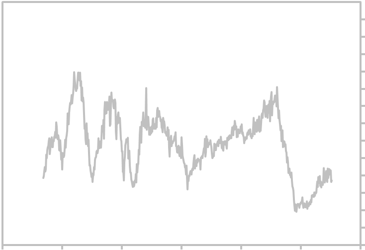
| New US Privately Owned Housing Starts - 49 Year Graph |
| Historical Housing Starts Graph |
This historical graph shows monthly New US Privately Owned Housing Starts. Measurement is in
Thousands of Units (seasonally adjusted annual rate). For the forecast and other links related to this
economic indicator, click the links below. Updated Thursday, May 31, 2018.
Thousands of Units (seasonally adjusted annual rate). For the forecast and other links related to this
economic indicator, click the links below. Updated Thursday, May 31, 2018.
| 2000 |
| 2250 |
| 2500 |
| 1750 |
| 2750 |
| 3000 |
| 3250 |
| 250 |
| 500 |
| 750 |
| 1000 |
| 1250 |
| 1500 |
| 0 |
| 10 Year Chart - US Housing Starts 49 Year Graph - Historical Housing Starts |
| ||||||||||||||||||||||||||||||||||||||||||||||||||||||||||||||||||||||||
| ______________________________________________________________________________ Search Report a Problem with this Page Site Map Contact us Privacy Policy Terms of Use/Disclosure SignalTrend Inc. 2008 - 2015, All Rights Reserved |
1/60
| 1/1970 |
1/1980
| 1/2000 |
| 1/20 |
| 1/2010 |
| 1/1990 |